8 Analysing shot data
In this chapter we will analyse categorical variables of film style, such as shot scales, types of camera movement, and types of relationships between shots. This is an area of computational film analysis that has been largely overlooked. Certainly compared to analysis of shot length data, there are relatively few studies of this type of data derived from films, but it has been shown that the distribution of shot scale in a film may be an important identifier of the style of an individual film, the style of an individual author across a body of work, and of various narrative and affective functions of a film, including viewer’s assessment of a film’s mood and their narrative engagement (Benini et al., 2016, 2022; Savardi et al., 2018, 2021; Svanera et al., 2019).
We will revisit my analysis of film style and narration in Rashomon (Kurosawa Akira, 1950) (Redfern, 2013b). This is one of the few pieces of research in computational film analysis for which I have not provided a tutorial to demonstrate how the analysis was performed or how to replicate the analysis, and this is a good opportunity to fill that gap. We will look at how to describe categorical variables and how to look at the temporal relationships between shots. Finally, we will apply multiple correspondence analysis to categorical shot data so we can look for relationships between different aspects of film style.
8.1 Categorical variables
A categorical variable has a measurement scale comprising a set of categories. Categorical variables are often called qualitative variables because an observation is assigned to a category because they possess some quality.
Categorical variables are also called nominal variables because the data values are the names of the categories describing an object and do not take on a numerical value. For example, a shot can be categorised as a ‘tracking shot’ and that is the data value that will be recorded for that shot. Some nominal variables have an implied ordering to the categories and are therefore called ordinal variables. For example, shot scale can be considered an ordinal variable because there is an ordering based on the relationship of the subject to the camera, from the big close up to the very long shot.
While an individual can be categorised by many different variables at the same time, each individual can only belong to one category for each variable. For example, a shot in a film may be a point-of-view shot and and a close-up; but it cannot be both a point-of-view shot and not a point-of-view shot or both a close-up and a long shot simultaneously.
Analysis of categorical variables involves looking at the frequency with which an event occurs (e.g., how many panning shots are there in a film?).
The methods we use to analyse categorical variables are different from those used to analyse quantitative variables (such as shot duration). For example, we cannot calculate the mean shot scale of a film because the data is not numerical. It simply does not make any sense to speak of the mean shot scale of a film.
8.2 Setting up the project
8.2.1 Create the project
Create a new project in RStudio from a new directory using the New project... command in the File menu and run the script projects_folders.R we created in Chapter 3 to create the folder structure required for the project.
8.2.2 Packages
In this project we will use the packages listed in Table 8.1.
| Package | Application | Reference |
|---|---|---|
| DescTools | Calcualte the mode of a categorical variable | Andri et mult. al. (2021) |
| FactoMineR | Perform multiple correspondence analysis on catgeorical data | Lê et al. (2008) |
| GDAtools | Plot the outcomes of multiple correspondence analysis | Robette (2022) |
| circlize | Produce chord diagrams to visual state transitions | Gu et al. (2014) |
| entropy | Calculate the entropy of discrete variables | Hausser & Strimmer (2021) |
| ggpubr | Combine plots into a single figure | Kassambara (2020) |
| ggrepel | Format labels when plotting | Slowikowski (2021) |
| here | Use relative paths to access data and save outputs | K. Müller (2020) |
| markovchain | Calculate transition matrices Markov chains | Spedicato (2017) |
| pacman | Installs and loads R packages | T. Rinker & Kurkiewicz (2019) |
| plotly | Create interactive data visualisations | Sievert et al. (2021) |
| scales | Format scales when plotting | Wickham & Seidel (2020) |
| tidyverse | Data wrangling and visualisation | Wickham et al. (2019) |
| viridis | Accessible colour palettes | Garnier (2021) |
| withr | Temporarily modify R’s global state | Hester et al. (2022) |
8.2.3 Data
The data used in this chapter comprises the data I collected for my analysis of film style and narration in Rashomon. This data can be accessed from my ResearchGate profile as an Excel spreadsheet. This spreadsheet contains the data for the four main narratives in the film: the Bandit’s story, the Wife’s story, the Husband’s story, and the Woodcutter’s second account from the latter stages of the film. Only shots from the narratives are included and shots in the courtyard are excluded as these are being narrated by the priest and the woodcutter. The brief narratives of the priest and the police agent are excluded as they comprise only a handful of shots and are too small for effective data analysis. I have also excluded the woodcutter’s walk through the forest and his discovery of the husband’s body. None of the shots from the scenes between the priest, woodcutter, and commoner under the Rashomon are included. By limiting the data set to the four narratives of the rape and murder, we will be comparing narratively similar sections of the film that all focus on the same set of events.
I collected data on four variables of film style, shot scale, camera movement, camera angle and shot type, with each variable having several categories.
Shot scale
I use seven shot scales based on the relative position to the subject, which is typically the human body: big close-up (BCU), close-up (CU), medium close-up (MCU), medium shot (MS), medium long shot (MLS), long shot (LS) and very long shot (VLS).
Camera movement
I assign shots to one of four broader categories of camera movement:
- shots in which the camera does not move but the lens is rotated (
RO) in the horizontal and/or vertical planes (pan, tilt, pan-and-tilt, etc.). -
mobile shots (
MO) in which the camera itself moves (tracking shots, dolly shots, etc.). -
hybrid shots (
HY) such as track-and-pans in which the camera both moves and the lens rotated. -
static shots (
ST), in which there is no camera movement.
Camera angle
The vertical position of the camera relative to the framed material:
- a
LOWangle with the camera placed below the subject looking up. - a
LEVEL, neutral angle looking straight-on into a scene irrespective of camera height. - a
HIGHangle with the camera placed above the subject looking down onto a scene.
Shot type
Three shot types are included in the study to describe how a shot is related to the previous shot.
-
Point-of-view (
POV) refers to shots framed from the position of one of the characters such that viewer is able to see what he or she sees. Shots not framed from a character’s position in a scene are classed as not point-of-view shots (X.POV). -
Reverse angle (
RA) shots are photographed from the opposite direction as the preceding shot, typically as part of a shot/reverse shot pattern or POV shots. Shots that do not meet this definition are classed as not reverse-angle shots (X.RA). - Finally shots are classified as either being framed along or very close to the axis of the lens (
AXIAL) of the previous shot or not (X.AXIAL).
Once you have downloaded the spreadsheet, save the MCA spreadsheet as a .csv file with the name rashomon.csv into the Data folder for this project and load this file into R.
pacman::p_load(here, tidyverse)
df_rashomon <- read_csv(here("Data", "rashomon.csv"))
Table 8.2 presents the data we will use in this chapter.
8.3 Describing shot data
In this section we will focus on describing a single variable – shot scale. We will look at how to analyse multivariate data below.
In R categorical variables are called factors and the categories of a factor are called levels. Working within the tidyverse suite of packages, the levels of a factor are conventionally organised alphabetically because when a .csv file is loaded into R, nominal variables are stored as character class objects (indicated by <chr>). However, as shot scale data has an order from close to distant based on the relationship of the subject to the camera we wish to preserve this ordering in our analysis. To do this we need to make scale a factor and set its levels, using the factor() and levels() functions, respectively. R will order the levels of the factor based on the sequence in which they are set by the user.
# Confirm that the scale variable is of class character
class(df_rashomon$scale)
## [1] "character"
# Enforce the ordering of levels of a factor
df_rashomon$scale <- factor(df_rashomon$scale,
                            levels = c("BCU", "CU", "MCU", "MS", "MLS", "LS", "VLS"))

# Confirm that the scale variable is now a factor
class(df_rashomon$scale)
## [1] "factor"We can convert all the character variables to factors using dplyr to check if a column in a data frame is of type character and, if so, convert it to a factor (indicated by <fct>).
df_rashomon <- df_rashomon %>%
  mutate(across(where(is_character), as_factor))
This method is efficient but will order the factors in the order in which they occur in the column. This may not be the ordering we want and so enforcing the ordering of factors of a variable individually may be the better approach.
8.3.1 Numerical summaries of categorical data
The most important concept in categorical data analysis is frequency, which is defined as the number of data points (\(n\)) in a category (\(i\)): (\(n_{i}\)). The relative frequency of the \(i\)-th category is equal to the frequency divided by the total number of data points (\(N\)) in a data set, expressed either as a proportion (\(p_{i}\)) or a percentage (\(100 * p_{i}\)):
\[ p_{i} = \frac{n_{i}}{N} \]
The sum of the proportions for a variable is equal to 1 and the sum of the percentages is equal 100%.
A frequency distribution is a representation of how the data points in a data set are distributed across all categories (\(K\)) in either tabular or graphical form.
To calculate a frequency distribution of the shot scales for the different narrators in Rashomon, we can use dplyr::count() after we have grouped the data by the narrator variable. If we do not group the data by narrator, count() will return a frequency distribution for the whole data set (i.e., the whole film). By default, count() will drop any categories with no observations but it is often useful to know which categories have a count of zero and so we will inhibit this behaviour by setting .drop = FALSE. We will also add columns to the data frame with the relative frequency of shot scales as a proportion (p) and a percentage (percent). Table 8.3 presents the proportions of shot scales in each narrative.
df_scale <- df_rashomon %>%
  select(narrator, scale) %>%
  group_by(narrator) %>%
  count(scale, .drop = FALSE) %>%
  mutate(p = round(n/sum(n), 3),
percent = 100 * p)To summarise a frequency distribution numerically, we want to describe its typical value and its variability.
The mode of a categorical variable is the category that occurs at least as frequently as any other category. Unlike the mean and median, R has no built in function for calculating the mode of a data set. (In R the mode() function classifies objects in the workspace according to their basic structure and is related to the class() function). The DescTools package has a function called Mode() that we can use (note the name of this function begins with a capital letter).
pacman::p_load(DescTools)

df_scale_summary <- df_rashomon %>%
  group_by(narrator) %>%
  summarise(mode = Mode(scale))

df_scale_summary
## # A tibble: 4 × 2
## narrator mode
## <chr> <fct>
## 1 Bandit MS
## 2 Husband MS
## 3 Wife MCU
## 4 Woodcutter MSNote that the mode of a data set may not be unique and there may be more than one category that satisfies the criteria of ‘occurring most frequently,’ hence the definition that the modal category occurs at least as frequently as another category.
Summarising the variability of a categorical variable is based on the relative frequencies of the categories. There are numerous methods available, but here we will focus on three concepts: unalikeability, diversity, and evenness.
The coefficient of unalikeability (\(u_{2}\)) describes how often observations differ from one another (Kader & Perry, 2007). This is a different concept of variability to that used when describing quantitative variables such as motion picture shot lengths, which describes by how much observations in a data set differ. \(u_{2}\) represents the proportion of possible comparisons between categories that are unalike (including comparisons of each category with itself), and ranges in value from 0, when all the categories contain equal numbers of observations, to 1, when all the categories are different from one another, and is equal to one minus the sum of the squared relative frequencies of each category:
\[ u_{2} = 1 - \sum_{i=1}^{K} p_{i}^2 \]
To measure how much variation there is within a categorical variable we need to be able to measure its diversity. The Shannon entropy (\(H\)) is equal to
\[ H = -\sum_{i=1}^{K} p_{i} \log_{2} p_{i} \]
and describes the uncertainty in predicting the type of a randomly selected observation. The value of \(H\) increases with increasing diversity. If all the shots in a film were framed the same way (for example, if they are all close ups), then there would be no uncertainty about predicting the scale of a randomly selected shot and \(H = 0\). The Shannon entropy is sensitive to categories containing fewer observations.
Simpson’s reciprocal diversity index (\(S\)) is sensitive to the most frequently occurring category of a variable and is equal to the reciprocal of the probability that two randomly selected observations from a data set belong to the same category:
\[ S = \frac{1}{\sum_{i=1}^{K} p_{i}^{2}} \]
and increases in value with increasing diversity, with a minimum value of 1 (i.e., if all the shots in a film were framed the same way then \(S = 1\)).
To describe the evenness of the distribution of shots across the seven categories of scale, we can calculate some statistics derived from \(H\) and \(S\) (see Heip et al. (1998) for an overview). Pielou’s \(J\) is the ratio of the observed entropy to the maximum possible entropy for \(K\) categories: \(J = \frac{H}{log_{2}(K)}\). Simpson’s evenness index is equal to \(S\) divided by the total number of categories: \(SE = \frac{S}{K}\). Both \(J\) and \(SE\) have the range from 0 to 1, with a value of 0 representing a maximally uneven distribution (i.e., all the observations belong to a single category) and a value of 1 representing a perfectly even distribution.
To calculate the entropy we will use the entropy.empirical() from the entropy package, with the argument that units = "log2". This will set the units of \(H\) to bits, but the units themselves are irrelevant – it matters only that we are consistent is which logarithm we choose to work with. The mathematics for calculating \(S\), \(J\), and \(SE\) is simple enough that we can do it by hand.
pacman::p_load(entropy)

# Get the number of categories
K <- (unique(df_scale$scale)) %>% length

df_scale_summary <- df_scale_summary %>%
  mutate(
    # Coefficient of unalikeability
    df_scale %>%
      group_by(narrator) %>%
      mutate(u = round(1 - sum(p^2), 2)) %>%
      distinct(u),
    # Entropy
    df_scale %>%
      group_by(narrator) %>%
      mutate(H = round(entropy.empirical(p, unit = "log2"), 2)) %>%
      distinct(H),
    # Simpson's reciprocal diversity
    df_scale %>%
      group_by(narrator) %>%
      mutate(S = round(1/sum(p^2), 2)) %>%
      distinct(S)
  ) %>%
  mutate(
    # Pielou's J
    J = round(H/log2(K), 2),
    # Simpson's evenness
    SE = round(S/K, 2)) %>%
  rename("u~2~" = u)  # Add the subscript to the column name for display
Table 8.4 presents a numerical summary of the distribution of shot scales for each of the four selected narrators from Rashomon.
| narrator | mode | u2 | H | S | J | SE |
|---|---|---|---|---|---|---|
| Bandit | MS | 0.76 | 2.32 | 4.24 | 0.83 | 0.61 |
| Husband | MS | 0.78 | 2.44 | 4.44 | 0.87 | 0.63 |
| Wife | MCU | 0.75 | 2.35 | 4.07 | 0.84 | 0.58 |
| Woodcutter | MS | 0.80 | 2.56 | 5.03 | 0.91 | 0.72 |
From Table 8.4 we see that Kurosawa prefers a mid-scale framing for all four narratives, but that with a modal class of medium close up, shots in the Wife’s narrative tend to be framed closer to the subject than in the three other narratives, where the most frequently occurring shot type is the medium shot. The Wife’s narrative also shows less variability than the others, with lower unalikeability, diversity, and evenness. The Woodcutter’s version of events has greater variability than the other narrators. We will learn why this is the case later on.
8.3.2 Visualising categorical data
To illustrate how to produce simple and informative visualisations of a frequency distribution we will first look at shot scales in the Bandit’s narrative and then compare all four narratives side-by-side.
To begin, we will create a data frame for data from the Bandit’s narrative by filtering the df_scale data frame on the narrator variable. Figure 8.1 illustrates four ways of visualising the same data as a bar chart.
# Filter the shots in the Bandit's narrative
df_bandit_scale <- df_scale %>%
  filter(narrator == "Bandit")

# Bar chart of frequencies
frequency_plot <- df_bandit_scale %>%
  ggplot(aes(x = scale, y = n)) +
  geom_bar(stat="identity", fill = "#277F8E") +
  scale_x_discrete(name = "Shot scale") +
  scale_y_continuous(name = "Frequency") +
  theme_minimal()

# Flip the coordinates - note reordering of scale to put BCU at top of the y-axis
flipped_plot <- df_bandit_scale %>%
  ggplot(aes(x = reorder(scale, desc(scale)), y = n)) +
  geom_bar(stat="identity", fill = "#277F8E") +
  scale_x_discrete(name = "Shot scale") +
  scale_y_continuous(name = "Frequency") +
  coord_flip() +
  theme_minimal()

# Use scales::percent to format the y-axis as percentages automatically
percent_plot <- df_bandit_scale %>%
  ggplot(aes(x = scale, y = p)) +
  geom_bar(stat="identity", fill = "#277F8E") +
  scale_x_discrete(name = "Shot scale") +
  scale_y_continuous(name = "Relative frequency", labels = scales::percent) +
  theme_minimal()

# Add text labels to end of bars
text_labels_plot <- df_bandit_scale %>%
  ggplot(aes(x = scale, y = percent)) +
  geom_bar(stat="identity", fill = "#277F8E") +
  geom_text(aes(label = paste0(percent, "%")), vjust = -0.4, size = 3.2) +
  scale_x_discrete(name = "Shot scale") +
  scale_y_continuous(limits = c(0, 40), expand = c(0, 0)) +
  theme_classic() +
  theme(axis.line = element_blank(),
        axis.text.y = element_blank(),
        axis.ticks = element_blank(),
        axis.title.y = element_blank(),
        panel.grid = element_blank())

# Combine into a single figure
pacman::p_load(ggpubr)
figure <- ggarrange(frequency_plot, flipped_plot,
                    percent_plot, text_labels_plot,
                    nrow = 2, ncol = 2, align = "hv", labels = "AUTO")

# Call the figure
figure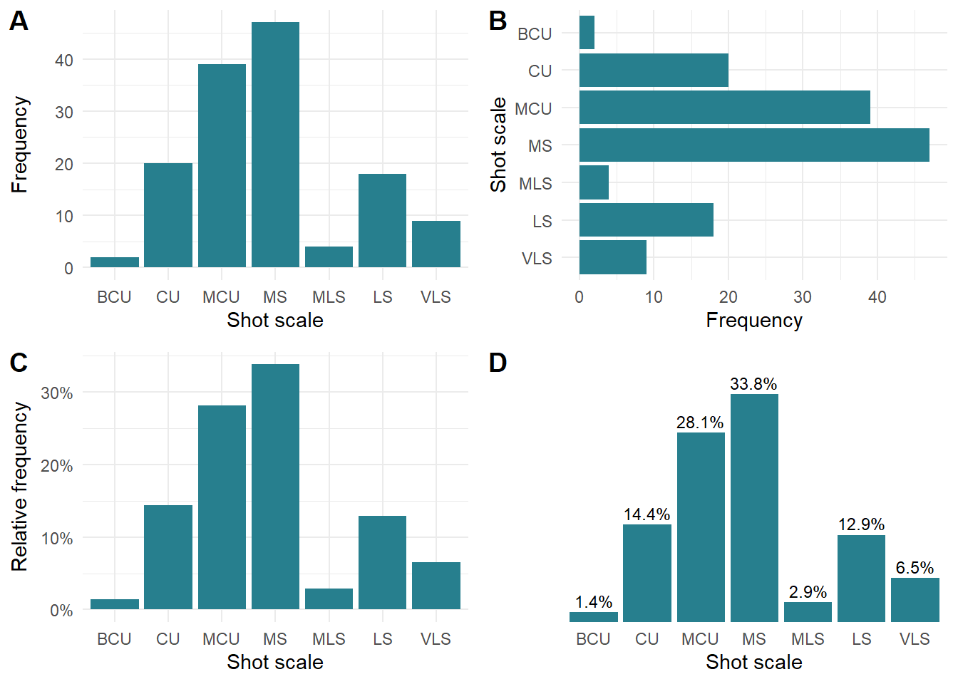
Figure 8.1: Visualising shot scale data for the Bandit’s narrative in Rashomon. (A) Barchart showing frequency of shot scales. (B) Flipped Barchart of shot scale frequencies. (C) Relative frequency of shot scales. (D) Relative frequency of shot scales with text labels.
Figures 8.1.A and 8.1.B plot the frequency of shot scales vertically and horizontally, with the latter plot created by adding coord_flip() when creating the plot. These plots present the same information because bar charts encode information in the height/length of the bars, and the choice of whether to use vertical or horizontal bars is not clear cut. Vertical bars can be better when representing categorical variables that have an order when read from left-to-right on the x-axis, showing relationships in sequence. A vertical bar chart may, however, be harder to read. Horizontal bar charts are easier to read (mimicking the left-right direction of reading in Western cultures), especially when space for the labels of the categories on the x-axis may be limited.
Figure 8.1.C plots the proportion (p) of shots in each category but by using scales::percent() the y-axis is automatically plotted as percent with nicely formatted tick labels that make it easy for the reader to understand what is being shown. The same result could be achieved by plotting the percentages and formatting the labels using an anonymous function, but the scales package makes this type of formatting routine. We can dispense with the y-axis completely if we add the data values as a labels on the bars using the percentage values from the (Figure 8.1.D), reducing the amount of ink in the chart without losing any information.
To compare the relative frequency of shot scales in all four narratives we can plot the data in Table 8.2 as a stacked bar chart (Figure 8.2). This makes it much easier to see how shots are distributed across different scales. The difference in style in the Wife’s narrative is immediately apparent in this plot, with the height of the segment for medium shots being much smaller than those of the other narratives. What is also revealed from this plot is that the Wife’s version of events also has more big close-ups and close-ups than those of the other narrators, clearly indicating that Kurosawa frames shots in the Wife’s narrative closer to the subject than he does at other points of the film. These three shot scales account for 72.4% of shots in the Wife’s narrative, which explains why the variability statistics for this narrative were lower. This information is available when the frequency distribution is presented in a tabular format but it is hard to see the pattern among the data, and it is obscured entirely by the numerical summaries in Table 8.4.
pacman::p_load(plotly, withr)

stacked_barchart <- df_scale %>%
  ggplot(aes(x = narrator, y = percent, fill = scale,
             text = paste0("Scale: ", scale,
                           "\nRelative freq: ", percent, "%"))) +
  geom_bar(position = "fill", stat="identity") +
  scale_x_discrete(name = "Narrator") +
  scale_y_continuous(name = "Relative frequency",
                     labels = scales::label_percent()) +
  scale_fill_viridis_d(name = "Scale") +
  guides(fill = guide_legend(nrow = 1, title.position = "top")) +
  theme_minimal()

# Use withr::with_options() to set the number of decimal places for the
# labels in the interactive plot
with_options(list(digits = 1), ggplotly(stacked_barchart, tooltip = "text"))
Figure 8.2: Stacked barchart of the relative frequency of shot scales for different narrators in Rashomon. ☝️
Stacked bar charts may it easier to see the distribution of observations for a variable across a set of categories within a grouping (such as a narrator in Rashomon) but they have their limitations, especially when it comes to making comparisons across groups. Comparing segments in a stack for the same shot scale across the different narrators is difficult because the segments do not begin at the same point. Consequently, it takes much more effort on the part of the reader to make sense of the data presented to them. This could be avoided by adding labels to the plot, but this can be challenging when the height of a segment in a stack is too small to accommodate the text with the result that labels are strewn across a plot removing the need for the bars. For comparing data across the different narrators we might as well have used Table 8.2, because we will have effectively reproduced that table by adding text to the plot. Figure 8.2 has been presented here as an interactive plot, allowing the user to select individual shot scales for comparison by clicking on a label in the legend while precise information is shown in the tooltip when hovering the mouse over a segment. It is the interactivity rather than the visualisation that is doing a lot of the work in communicating the structure of the data to the user.
Another way to compare shot scale data across the four narratives is to employ the principle of small multiples, and plot the bar charts for each narrator separately within a grid while using the same scale for each individual plot. The idea of small multiple was developed by Edward Tufte to take advantage of repetition in the graphical presentation of data:
Small multiples are economical: once viewers understand the design of one slice, they have immediate access to the data in all other slices. Thus as the eye moves from one slice to the next, the constancy of the design allows the viewer to focus on changes in the data rather than on changes in the grahicl design (Tufte, 1983: 48).
Figure 8.3 plots the shot scale data as a grid of bar charts using the facet_wrap() function in ggplot2. Each bar chart is created as a horizontal bar chart with narrator passed as a variable to facet_wrap() (note the tilde (~) before the variable name). This tells ggplot2 to make an bar chart for each individual narrator, with the layout specified by the number of columns (or rows) passed by ncol (or nrow). The data is presented on the same scale in each facet, making a direct comparison between different the different slices quick and easy (though this feature can be turned off if appropriate).
👈 Click here to find out why the y-axis on bar charts should start at 0
How to lie with data: truncate the y-axis of your bar chart
Because bar charts encode information in length of the bar, differences in between numerical values are represented as differences in the lengths of the bars.
Truncating the y-axis of a bar chart is a classic strategy for lying with statistics.
By truncating the range of the y-axis, differences in the data no longer correspond to the relative differences in the length of the bars. This can make small differences appear large, leading to the reader to a misinterpret the meaning of the data. For example, the two plots below show the same data, but by truncating the axis in the B plot we can make the value for 2022 appear five times larger than that for 2018, implying there has been a 500% over time, even though there is only a 3.2% difference in the actual data values (3.14 and 3.15, respectively).
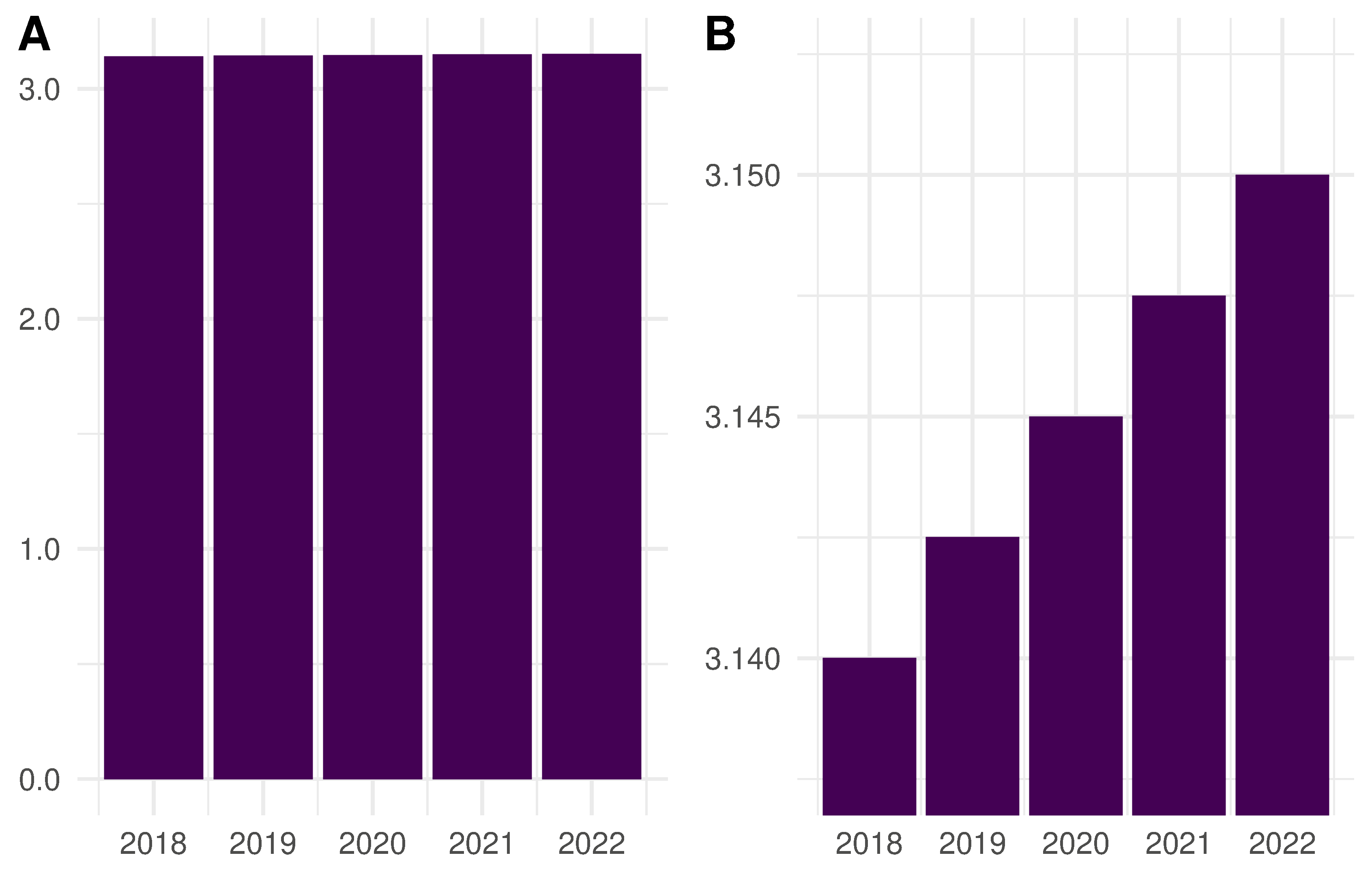
In order to avoid deceiving the reader, the y-axis on a bar chart should begin with zero so that differences in the representation of the data correspond to the actual numerical differences in the data.
This rule does not necessarily apply to other types of plot, such as box plots or line charts, that encode data in different ways to bar charts.
df_scale %>%
  ggplot(aes(x = reorder(scale, desc(scale)), y = p, fill = scale)) +
  geom_bar(stat="identity") +
  scale_x_discrete(name = "Shot scale") +
  scale_y_continuous(name = NULL,
                     labels = scales::label_percent(accuracy = 1)) +
  scale_fill_viridis_d(name = "Scale") +
  coord_flip() +
  facet_wrap(~narrator, ncol = 2) +
  theme_minimal() +
  theme(legend.position = "none",
        strip.text = element_text(size = 10, face = "bold", hjust = 0),
        # Prevent overlap of labels from adjacent facets
        panel.spacing = unit(15, "pt"),
        plot.margin = margin(0.2, 0.4, 0.2, 0.2, "cm"))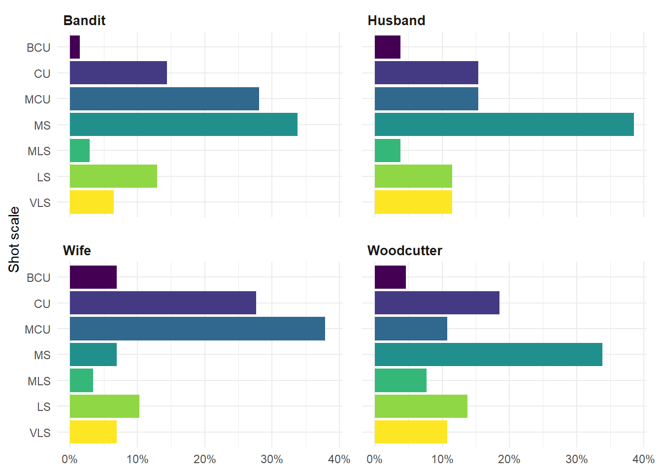
Figure 8.3: Small multiples plot of the relative frequency of shot scales for different narrators in Rashomon.
Figure 8.3 presents the same data as the stacked bar chart and leads us to the same conclusions. The closer framing of the Wife’s narrative is clear to see, as is the tendency of medium shots to dominate the other sections of the film. The greater variability of the Woodcutter’s narrative in comparison to that of the other narrators is evident, and shows how different this version of the story is compared to that of the Husband, in particular. It requires much less effort to understand the data when it is presented as small multiples.
👈 Click here to learn the difference between bar charts and histograms
Bar charts are not histograms
Although they are visually similar, bar charts and histograms are two different types of graph that provide different types of information about different types of variables. Like a bar chart, a histogram is produced by visualising data as bars against a numerical scale representing frequency but these two types of charts have different use cases and are conceptually quite different.
Bar charts visualise the count data or probability mass function of a discrete qualitative categorical variable (e.g., shot scales), allowing us to compare the number of data points in different categories of a variable.
Histograms are a simple form of density estimation that allow us to see the overall distribution of a continuous quantitative numerical variable (e.g., shot length data) by visualising the frequency of data points after they have been sorted into ranges of values called bins or the probability density function.
In a bar chart, frequency is expressed as the height of the bar and the width of the bar has no meaning. In a histogram, frequency is expressed as the area of a bar. This means that the bins of a histogram do not need to be of equal width.
In a bar chart the gaps between the categories represent the discrete nature of a variable – the categories of a variable are discontinuous. Because the variable represented by a histogram is continuous neighbouring bars in a histogram must touch to indicate that the variable is continuous: the point at which one bin ends is the point at which the next bin begins and a gap between the bars indicates that a bin contained no data points.
Bar charts count individual entities, whereas histograms group data by a range of values. Consequently, bar charts display exact values – we know exactly how many data points belong to each category of a variable. Using a histogram there is a loss of precision – we know how many data points lies within the range of values defined by a bin but we do not know exactly how many data points had specific values.
Some concepts that we use to describe the features of a histogram are not relevant when describing a bar chart. For example, we can speak of the skewness of a histogram because it estimates the density of the data, but skewness has no meaning when talking about a bar chart. This is because the categories of a bar chart have no intrinsic ordering (ordinal variables can be arranged from left-to-right or right-to-left and will represent the same information); whereas the data in a histogram must be arranged in order of size from left-to-right increasing in size from smallest-to-greatest.
It is important to know the difference between a bar chart and histogram and to use them correctly.
8.4 Temporal structure
We can analyse the temporal structure of categorical variables in film style by exploring them as sequences of events in time.
A Markov chain is stochastic model comprised of a set of transitions described by a probability distribution that traces a sequence of possible events \(X_{1}, X_{2}, X_{3}, ...\). In the case of shot scales in Rashomon, the possible events are the different scales used to frame shots in temporal sequence: for example, \(LS, MCU, LS, MS, …\).
Markov chains are memoryless, which means that the probability that a sequence is its current state is determined only by its previous state (\(Pr(X_{n+1} = x|X_{n} = x_{n})\)) and does not take into account the full chain of prior states. This may not be a realistic assumption for analysing film style, which may have longer patterns of shot scales. For example, the classical Hollywood style of opening a scene with an establishing shot and moving closer to the characters though the sequence dolly > master > two-shot > over > over > single > single implies a structure with some degree of memory. There is, however, a lack research on the sequencing of shot scales in general, and certainly none for 1950s Japanese cinema in particular, that tells what that degree of memory might be. (There is research on memory in shot length data: see Cutting et al. (2018)). Research in this area will likely require the development of marked point process models of film style, a topic that lies beyond the scope of this book.
We will therefore proceed in our analysis of the temporal structure of shot scales in Rashomon on the basis that describing this aspect of film style as a Markov chain can tell us something useful about the style of the film and that, at the very least, we are learning methods that we can use to answer bigger questions about style in the cinema, including questions about temporal sequences in the cinema.
8.4.1 Transition matrix
The transition probabilities of a markov chain are stored in a transition matrix. The transition matrix is a square matrix in which the probability of transitioning from state \(i\) to state \(j\) is represented by the \((i,j)\)-th entry in the matrix. Thus, in the matrix \(P\), which describes the Markov chain of shot scale transitions for the Bandit’s narrative, the entry \(P_{(CU,MCU)}\) describes the probability of cutting from a close up to a medium close up. The transition probabilities of moving from a state \(i\) to the next state \(j\) sum to 1.
The first step in producing the transition matrix is get the shot scale data for each of the four narrators from the original df_rashomon data frame we created above and to separate this data out into a data frame for each narrator. This does not mean that we need to create four separate data frames. Using dplyr’s group_by() and nest() functions, we can collect the data for each narrator in the sample and store these as inner data frames within an a single overall data frame. The result is a data frame, df_narrators, that has two variables: narrator, which is a list of the narrators in the sample, and data, which is a list containing the shot scale data for each narrator nested as a data frame in the df_narrators data frame.
df_narrators <- df_rashomon %>%
  select(narrator, scale) %>%
  group_by(narrator) %>%
  nest()

df_narrators
## # A tibble: 4 × 2
## # Groups: narrator [4]
## narrator data
## <chr> <list>
## 1 Bandit <tibble [139 × 1]>
## 2 Wife <tibble [29 × 1]>
## 3 Husband <tibble [26 × 1]>
## 4 Woodcutter <tibble [65 × 1]>To access the shot scale data for a narrator we need to access the data variable in df_narrators by calling its index using double square brackets. As the data variable is the the second variable in df_narrators it has the index 2: [[2]]. Then we the access data frame within the list of data frames stored in data that we want to use, again by calling its index using double square brackets, and extract the shot scale data using the $ operator to interact with the data.
# Get the shot scale data for the Husband's narrative:
# 2 is the index of the list of data frames in df_narrators
# 3 is the index of the data frame containing the shot scale data for the Husband's narrative
# scale is the variable containing the shot scale data
head(df_narrators[[2]][[3]]$scale)
## [1] VLS CU MCU MS MLS CU
## Levels: BCU CU MCU MS MLS LS VLSWe will use the function createSequenceMatrix() from the markovchain package to calculate the transition matrix, looping over each of the nested data frames in df_narrators. This loop will produce two outputs for each narrator: the transition probabilities of moving from one shot scale to another, which will be compiled into a single data frame df_transitions for plotting the transition matrices as small multiples in a a facet plot; and a list, matrix_transitions, which will collect the matrix of transition probabilities for each narrator that we will use to create chord diagrams below.
# Load the markovchain package
pacman::p_load(markovchain)

# Initialise data structures to store the results of the loop
df_transitions <- data.frame()
matrix_transitions <- list()

for (i in 1:length(df_narrators[[1]])){

  narrator <- df_narrators[[1]][i]
  dat <- factor(df_narrators[[2]][[i]]$scale)

  # Calculate the transition matrix for the sequence of shot scales
  dat_sequence_matrix = createSequenceMatrix(dat, toRowProbs = TRUE)
  # Add the matrix to the list of matrices
  matrix_transitions[[i]] <- dat_sequence_matrix

  # Convert matrix to data frame and rearrange for plotting
  df_sequence_matrix <- dat_sequence_matrix %>%
    data.frame %>%
    rownames_to_column() %>%
    gather(colname, value, -rowname) %>%
    rename(From = rowname, To = colname, p = value) %>%
    mutate(narrator = rep(narrator, length(From))) %>%
    relocate(narrator) %>%
    arrange(From)

  df_transitions <- rbind(df_transitions, df_sequence_matrix)

}
We have created two new variables From and To in the df_transitions data frame and it is necessary to define these variables as factors and to re-assert the order of their levels.
# We need to reassert factor levels for newly created variables
df_transitions$From <- factor(df_transitions$From,
                              levels = c("BCU", "CU", "MCU", "MS", "MLS", "LS", "VLS"))

df_transitions$To <- factor(df_transitions$To,
                              levels = c("BCU", "CU", "MCU", "MS", "MLS", "LS", "VLS"))
Figure 8.4 plots the shot scale transition matrices for each of the four narrators in Rashomon.
ggplot(data = df_transitions) +
  geom_tile(aes(x = From, y = To, fill = p)) +
  geom_text(aes(x = From, y = To, label = round(p, 2)), colour = "white", size = 3) +
  scale_y_discrete(limits = rev) +  # Reverse the direction of the y-axis
  scale_fill_viridis_c(name = NULL) +
  facet_wrap(~narrator, ncol = 2) +
  coord_fixed() +  # Render the square matrix as a square plot
  theme_minimal() +
  theme(legend.position = "none",
        strip.text = element_text(size = 12, face = "bold", hjust = 0))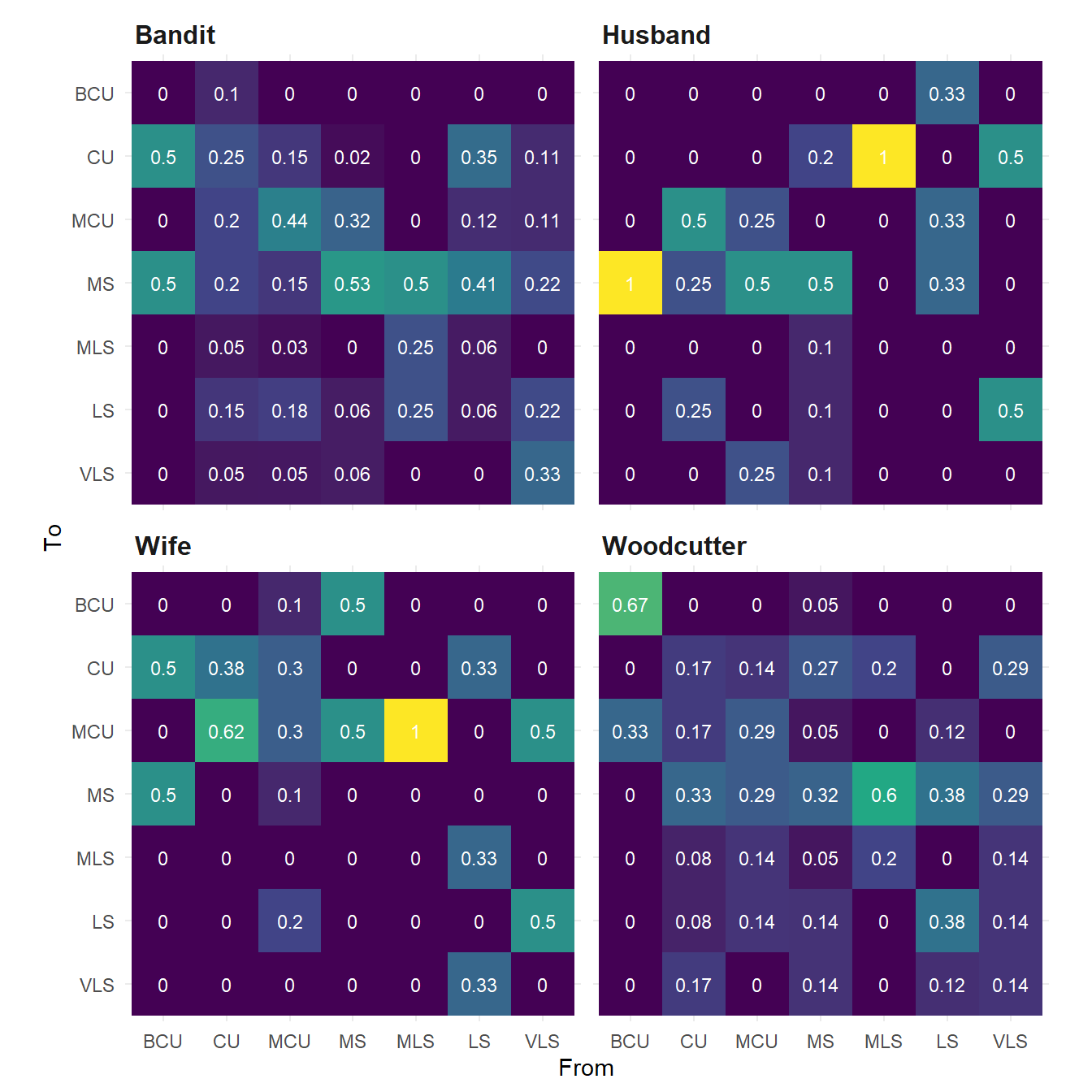
Figure 8.4: Shot scale tranisition probabilities for four narrators in Rashomon. Note that the columns of the matrix all sum to one.
Figure 8.4 also allows us to see what Kurosawa does and does not do in terms of sequencing shots. For example, none of the narratives include very long shots followed by a big close up. Transitions from close ups and medium close-ups to medium-long, long, and very long shots do occur but are less common that transitions from closer framed shots (i.e., medium shots and closer) to shots of a similar scale. Again, the tendency of the Wife’s narrative to be dominated by closer frame shots is evident in the transition matrix for this section of the film, with the largest probabilities concentrated in the North West corner of the matrix indicating that Kurosawa tends to cut from closer framed shots to closer shots in this narrative.
In none of the narratives does Kurosawa cut from a big close up to anything wider than medium shot and he rarely cuts from a wide shot to a big close up. Kurosawa thus avoids cutting from one extreme of the range of shot scales to another. There is a key exception to this. One of the stand out features of the transition matrices is that in the Husband’s narrative, wider-framed shots (i.e., MLS, LS, and VLS) tend to be followed by shots that are framed as medium shots or closer and are rarely followed by wider-framed shots, a pattern that we see in the other sections of the film. This is the only narrative in Rashomon in which a long shot is followed by a big close up. As we shall see when we come to the multivariate analysis of the film, this is because the Husband’s narrative tends to include more transitions between shots framed along the axis of the lens, moving towards a subject from distant to close framing, whereas the other narratives depends more on the use of reverse-angle cuts and POV-shots with matched shot scales.
The narratives of the Bandit and the Woodcutter exhibit greater variety in the transitions between shot scales, though this is due the fact that these narratives have many more shots – and, therefore, more transitions – than those of the Wife and the Husband. Like, the transitions matrix for the Wife’s narrative, the matrix of the Bandit’s narrative also shows a tendency for transitions between shots framed as medium shots and closer, though unlike the Wife’s narrative it also exhibits some variety in the transitions from wider-framed shots across the range of shot scales excepting big close-ups.
The Woodcutter’s narrative does have some high transition probabilities in its matrix – the probability that a big close up will be followed by another big close up is 0.67, while the there is a 0.6 probability that a medium long shot will be followed by a medium shot – but does not show any particular pattern among the transition probabilities. In my original study of style and narrative in Rashomon, I argued that the Woodcutter’s narrative employed elements common to the other three versions of events (Redfern, 2013b: 33). This is also evident in the Woodcutter’s transition matrix. Like the Bandit and the Wife, the Woodcutter’s account features transitions between closely-framed shots in the north-west corner of the matrix, but the probabilities tend to be lower than elsewhere. Like the matrices of the Bandit and the Husband, we see a variety of transitions from close-framing to wide framing in the south-west corner, but again this is not as prevalent as elsewhere. As we saw above, medium shots are the modal shot scale in the Woodcutter’s narrative, but unlike the Bandit or the Husband, transitions from and to medium shots are more evenly distributed across the other shot scales. The Woodcutter’s narrative thus exhibits some stylistic similarities to the other three sections, but is not the same as any of them. This reflects the status of this narrative in the film as the Woodcutter recounts the same events as the other narrators but does so from the position not as a participant in the events in the forest, but as an external observer.
8.4.2 Chord diagrams
We can visualise the data stored in the transition matrices as chord diagrams using the circlize package. Chord diagrams represent the weight of connections between categories of a variable as a set of chords across a circle, with the categories arranged in order around the circumference. The size of the chord is proportional to the weight of the connections, which for our shot scale data is determined by the probability of transitioning from one shot scale to another.
circlize uses R in-built graphics package rather than ggplot2, and so to arrange the four chord diagrams for the shot scale data we will need to tell R we want to draw a \(2 \times 2\) matrix of plots and to fill these by rows by setting a parameter using par(mfrow = c(2, 2)), which will fill the plot matrix from left to right across a row before moving on to the next row down. Alternatively, we could set par(mfcol = c(2, 2)), which will also create a \(2 \times 2\) matrix of plots, but will fill them by columns, moving from top-to-bottom of a column before moving to the next column to the right. To add a title to each plot in the matrix we use the margin text function mtext(), which allows us to control the placing and formatting of the text. To add the text to top margin of a plot we need to set side = 3.
# Load the circlize package. Also load viridis for colouring the plot
pacman::p_load(circlize, viridis)

# Get the number of colours required for the palette
k <- max(dim(dat_sequence_matrix))

# Set the grid for plotting two rows and two columns of plots
par(mfrow = c(2, 2))

# The Bandit's narrative
chordDiagram(matrix_transitions[[1]], grid.col = viridis(k),
             annotationTrack = c("name", "grid"), annotationTrackHeight = c(0.03, 0.05))
mtext(df_narrators$narrator[1], side = 3, adj = 0, line = 0, cex = 1.1, font = 2)

# The Wife's narrative
chordDiagram(matrix_transitions[[2]], grid.col = viridis(k),
             annotationTrack = c("name", "grid"), annotationTrackHeight = c(0.03, 0.05))
mtext(df_narrators$narrator[2], side = 3, adj = 0, line = 0, cex = 1.1, font = 2)

# The Husbands's narrative
chordDiagram(matrix_transitions[[3]], grid.col = viridis(k),
             annotationTrack = c("name", "grid"), annotationTrackHeight = c(0.03, 0.05))
mtext(df_narrators$narrator[3], side = 3, adj = 0, line = 0, cex = 1.1, font = 2)

# The Woodcutter's narrative
chordDiagram(matrix_transitions[[4]], grid.col = viridis(k),
             annotationTrack = c("name", "grid"), annotationTrackHeight = c(0.03, 0.05))
mtext(df_narrators$narrator[4], side = 3, adj = 0, line = 0, cex = 1.1, font = 2)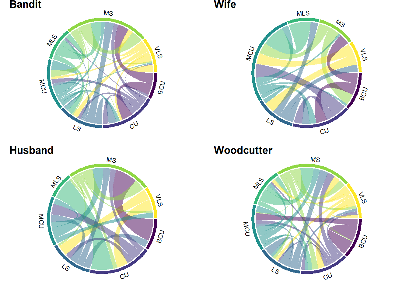
Figure 8.5: Chord diagrams of shot scale transitions for four narrators in Rashomon.
Figure 8.5 presents us with the same information as the transition matrices above in a more aesthetically pleasing way. The chord diagrams obscure small transition probabilities resulting in thin arcs, but it does allow us to quickly pick out patterns at a glance (which is again supported by the use of small multiples) rather than becoming focused on the detailed numerical information in the transition matrices that may lead us to overlook the general picture. For example, it is immediately apparent that the narratives of the Bandit and the Wife feature heavily-weighted transitions between big close ups and close ups and medium shots, while the Husband’s narrative features heavily-weighted transitions from big close ups to medium shots but not to close ups. The chord diagram of the Woodcutter’s narrative shows neither of the properties, with heavily-weighted transitions from big close ups to big close ups and to long shots.
8.5 Multivariate analysis
So far we have explored a single categorical variable of film style in isolation. However, each shot in a film requires filmmakers to make multiple decisions about how it is to be framed and how it relates to other shots. An understanding of how the different elements of a film’s style are organized to produce its formal structure requires analysing several variables simultaneously.This requires us to shift from univariate statistical methods to multivariate statistical methods:
Multivariate statistical analysis is the simultaneous statistical analysis of a collection of variables, which improves upon separate univariate analysis of each variable by using information about the relationships between the variables. Analysis of each variable is very likely to miss uncovering the key features of, and any interesting ‘patterns’ in, the multivariate data (Everitt & Hothorn, 2011: 2, original emphasis).
The Rashomon data set includes six categorical variables, three describing the behaviour of the camera (shot scale, camera movement, and camera angle) and three encoding relationships between shots (POV, reverse angle, axial). To explore relationships between these variables we will use mutliple correspondence analysis (MCA) as a multivariate approach to geometric data analysis for nominal categorical data.
MCA is a descriptive method for revealing patterns in complex data sets by locating the observed individuals and variables in low-dimensional Euclidean space. Interpretation of the representation of the variables in MCA is based on the geometry of points in that space (see Abdi & Valentin, 2007):
- when two individuals are close to one another they tend to have the same levels of the nominal variables. In the Rashomon data set, the observed individuals are the shots in the film and shots that lie close to one another in the map produced by MCA tend to be stylistically similar.
- proximity between the categories of different variables means that those levels tend to occur together. For example, proximity between the
X.RAcategory of the reverse angle variable and theAXIALcategory of the axial variable indicates that shots that are related by cutting along the axis of the lens tend not to be related by reverse angle cuts, which is exactly what we would expect. Categories that lie on the opposite sides on an axis are contrasted with one another, and the further along an axis a point lies, the greater its contribution to the determination of that axis. - proximity between different categories of the same variable indicates the associated groups of observations are similar, but individuals cannot be stylistically similar to one another as the nominal categories are exclusive (i.e., a shot is either a close up or it is not).
We will treat narrator as a supplementary variable. This means that this variable is not used when calculating the results of the MCA and does not contribute to the definition of the axes or the distribution of the individual shots or variables. narrator and its associated categories are projected onto the low-dimensional space defined by the other active variables so that we can see how narrator relates to the various stylistic variables in the data set.
MCA is performed using the indicator matrix derived from the df_mca data frame we will create below. Each column in the matrix represents one category of a variable and each row in the matrix takes a binary value depending on whether an individual does (1) or does not (0) belong to the category. It will not be necessary to interact with the indicator matrix but it is useful to understand how the data is represented at the different stages when doing MCA on our data set.
There are several R packages for geometric data analysis. Here we will use the FactoMineR package, which has a range of tools for performing different forms of geometric data analysis, including MCA via the MCA() function. We will also use the GDAtools package to aid in our visualisation of the data. We could use the factoextra (Kassambara & Mundt, 2020) package to produce plots derived from the results of applying multiple correspondence analysis to the Rashomon data. Here, we want to understand how FactoMineR returns results to and how we can navigate the different components of those results, so we will create summaries and visualisations from scratch.
# Load the packages for multiple correspondence analysis
pacman::p_load(FactoMineR)

# Remove the first column of the data frame that lists the shot number
df_mca <- df_rashomon %>% select(-shot)

# Calculate the results of the multiple correspondence analysis with narrator
# set as a supplementary qualitative variable by index (1)
res_mca <- MCA(df_mca, quali.sup = 1, graph = FALSE)
The object returned by FactoMineR::MCA() is dense and contains a lot of information. We can get a summary of the main features in which we are interested using FactoMineR::summary.MCA(). By default, this function returns the first results for each part of the output of MCA(). Here we will summarise the results for all the variables and categories in the data set (nbelements = Inf – note this will simply return all the variables and categories rather than an infinite result), and we will suppress printing the results for every shot in the data set by setting the number of individuals (i.e., shots) to zero (nbind = 0). This will allows us to focus on the variables. We will also limit the results to the first two dimensions (ncp = 2).
summary.MCA(res_mca, nbelements = Inf, nbind = 0, ncp = 2)##
## Call:
## MCA(X = df_mca, quali.sup = 1, graph = FALSE)
##
##
## Eigenvalues
## Dim.1 Dim.2 Dim.3 Dim.4 Dim.5 Dim.6 Dim.7
## Variance 0.297 0.215 0.207 0.192 0.187 0.171 0.166
## % of var. 12.727 9.211 8.861 8.241 8.005 7.320 7.135
## Cumulative % of var. 12.727 21.939 30.800 39.041 47.046 54.366 61.501
## Dim.8 Dim.9 Dim.10 Dim.11 Dim.12 Dim.13 Dim.14
## Variance 0.161 0.155 0.138 0.134 0.123 0.113 0.074
## % of var. 6.915 6.641 5.902 5.735 5.284 4.837 3.185
## Cumulative % of var. 68.416 75.057 80.959 86.694 91.978 96.815 100.000
##
## Categories
## Dim.1 ctr cos2 v.test Dim.2 ctr cos2 v.test
## BCU | -0.126 0.028 0.001 -0.362 | -1.514 5.491 0.073 -4.342
## CU | -0.088 0.073 0.002 -0.637 | -0.781 8.026 0.125 -5.672
## MCU | -0.375 1.860 0.043 -3.344 | -0.602 6.611 0.112 -5.364
## MS | -0.018 0.006 0.000 -0.192 | 0.269 1.758 0.033 2.918
## MLS | 0.484 0.558 0.010 1.637 | 0.877 2.532 0.034 2.966
## LS | 0.148 0.157 0.003 0.911 | 0.893 7.884 0.117 5.483
## VLS | 0.903 3.711 0.072 4.309 | 1.058 7.041 0.099 5.049
## HY | 1.058 1.455 0.027 2.617 | -0.641 0.738 0.010 -1.585
## MO | -0.016 0.002 0.000 -0.098 | 1.502 22.963 0.341 9.378
## RO | 0.085 0.065 0.001 0.599 | 0.937 11.050 0.170 6.624
## ST | -0.053 0.107 0.006 -1.249 | -0.489 12.683 0.517 -11.545
## HIGH | -0.123 0.210 0.005 -1.134 | -0.076 0.110 0.002 -0.696
## LEVEL | 0.385 4.112 0.145 6.114 | -0.286 3.137 0.080 -4.543
## LOW | -0.618 5.544 0.133 -5.863 | 0.619 7.682 0.134 5.872
## POV | -1.226 21.498 0.514 -11.516 | 0.104 0.215 0.004 0.979
## X.POV | 0.419 7.352 0.514 11.516 | -0.036 0.073 0.004 -0.979
## RA | -0.831 18.254 0.615 -12.595 | -0.102 0.383 0.009 -1.552
## X.RA | 0.740 16.256 0.615 12.595 | 0.091 0.341 0.009 1.552
## AXIAL | 1.462 16.218 0.334 9.285 | -0.325 1.109 0.017 -2.065
## X.AXIAL | -0.228 2.534 0.334 -9.285 | 0.051 0.173 0.017 2.065
##
## BCU |
## CU |
## MCU |
## MS |
## MLS |
## LS |
## VLS |
## HY |
## MO |
## RO |
## ST |
## HIGH |
## LEVEL |
## LOW |
## POV |
## X.POV |
## RA |
## X.RA |
## AXIAL |
## X.AXIAL |
##
## Categorical variables (eta2)
## Dim.1 Dim.2
## scale | 0.114 0.507 |
## movement | 0.029 0.612 |
## angle | 0.176 0.141 |
## pov | 0.514 0.004 |
## ra | 0.615 0.009 |
## axial | 0.334 0.017 |
##
## Supplementary categories
## Dim.1 cos2 v.test Dim.2 cos2 v.test
## Bandit | -0.187 0.040 -3.229 | 0.033 0.001 0.570 |
## Husband | 0.684 0.052 3.672 | -0.087 0.001 -0.468 |
## Wife | -0.271 0.009 -1.545 | -0.246 0.008 -1.402 |
## Woodcutter | 0.247 0.020 2.292 | 0.074 0.002 0.688 |
##
## Supplementary categorical variables (eta2)
## Dim.1 Dim.2
## narrator | 0.089 0.009 |The summary output presents us with a lot of information:
-
Call: this is the call we made toMCA()and is for reference only. -
Eigenvalues: this information describes the variance associated with each dimension as an absolute value and as a percentage of the total variance of the analysis. Even though we requested results for the first two dimensions only the results for all dimensions will always be displayed in this section of the summary. FactoMineR performs multiple correspondence analysis using the indicator matrix and does not apply a correction to the eigenvalues so the amount of variance associated with each dimension is not terribly informative (other R packages for geometric data analysis do apply the correction). -
Categories: for each category in the data set we get the coordinate of that category in each dimension (Dim.1andDim.2) of the output; the contribution (ctr) of that category to the total variance of each dimension as a percentage; the quality of the representation (cos2) for a category in each dimension, with better represented categories having higher values; and a standardised score from a Normal distribution from a test to determine if the mean of the category is different from the overall mean (v.test), for which the sign indicates if the value is less than or greater than the overall mean with distance from the overall mean increasing with the absolute value of the statistic. -
Categorical variables (eta2): the square correlation between a variable and a dimension, which we will use to construct the variables map below. -
Supplementary categories: the coordinate, quality, and difference from the overall for the categories that are not used to calculate the results of the analysis. -
Supplementary categorical variables (eta2): the square correlation between a supplementary variable and a dimension.
It is easier to explore this information visually, and so we will create plots to see instantly which categories contribute to the variance of a dimension and how they are related to one another.
We can access the indicator matrix via res_mca$call$Xtot. Comparing the head of the indicator matrix with the head of the df_mca data frame we see that they encode the same information in different ways. The first row in the df_mca data frame records that this shot is a static (ST) long shot (LS) from a high angle (HIGH) and is not a POV shot (X.POV), a reverse angle cut (X.RA) or an axial cut (X.AXIAL). The indicator matrix presents the same information with a value of 1 for each of these categories and a 0 elsewhere. We also see the that categories for the narrator variable have been moved to the right-hand side of the matrix because a narrator is a supplementary variable.
head(df_mca, 3)## # A tibble: 3 × 7
## narrator scale movement angle pov ra axial
## <chr> <fct> <chr> <chr> <chr> <chr> <chr>
## 1 Bandit LS ST HIGH X.POV X.RA X.AXIAL
## 2 Bandit MCU ST LEVEL X.POV X.RA AXIAL
## 3 Bandit LS RO LOW X.POV X.RA X.AXIAL
head(res_mca$call$Xtot, 3)## BCU CU MCU MS MLS LS VLS HY MO RO ST HIGH LEVEL LOW POV X.POV RA X.RA AXIAL
## 1 0 0 0 0 0 1 0 0 0 0 1 1 0 0 0 1 0 1 0
## 2 0 0 1 0 0 0 0 0 0 0 1 0 1 0 0 1 0 1 1
## 3 0 0 0 0 0 1 0 0 0 1 0 0 0 1 0 1 0 1 0
## X.AXIAL Bandit Husband Wife Woodcutter
## 1 1 1 0 0 0
## 2 0 1 0 0 0
## 3 1 1 0 0 0We use res_mca$var$eta2 to access the the squared correlation between variables and dimensions for the active variables, where var is short for variable. To get the same data for narrator variable we use res_mca$quali.sup$eta2, where quali.sup is short for qualitative supplementary variable.
Figure 8.6 plots the variables map. There is a clear distinction between variables associated with Dimension 1 (axial, pov, ra) and those associated with Dimension 2 (movement, scale). This represents a distinction between the way shots are combined to present the different perspectives of the narrators and the way information is presented to the viewer through the use of framing and camera movement. angle contributes to both axes because it has both perspectival and presentational aspects: for example, a low camera presents visual information to the viewer and may also may represent the perspective of a character. narrator lies close to Dimension 1 and this indicates that the difference between the four narratives in the data set are a matter of perspective rather than presentation.
# Load the ggrepel package for better labels
pacman::p_load(ggrepel)

# Gather eta2 details from res_mca and format data frames
# for the variables and supplementary variables
df_var_eta2 <- data.frame(res_mca$var$eta2) %>%
  select(Dim.1, Dim.2) %>%
  rownames_to_column(., var="variable")

df_narrators_eta2 <- data.frame(res_mca$quali.sup$eta2) %>%
  select(Dim.1, Dim.2) %>%
  rownames_to_column(., var="variable")

# Combine the two data frames
df_eta2 <- rbind.data.frame(df_var_eta2, df_narrators_eta2)

ggplot(data = df_eta2, aes(x = Dim.1, y = Dim.2)) +
  geom_point(aes(colour = variable)) +
  geom_text_repel(aes(label = variable, colour = variable)) +
  scale_x_continuous(name = "Dimension 1 (12.7)%") +
  scale_y_continuous(name = "Dimension 2 (9.2%)") +
  scale_colour_viridis_d() +
  theme_minimal() +
  theme(legend.position = "none")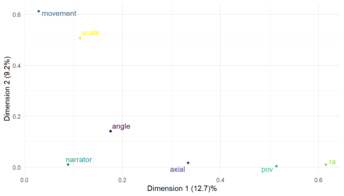
Figure 8.6: Variables map of film style for the four narratives in Rashomon. narrator is a supplmentary variable.
Figure 8.7 plots the contributions of the variable categories to the first two dimensions of the analysis. The reference line is at \(100\% \times (1/K)\), where \(K\) is the number the number of active categories (i.e., categories for supplementary variables are not included). For this data set, \(K = 20\) and so the reference line is at 5%, with categories with contributions above this reference point making a significant contribution to the overall variance of the dimension. The data is the same as the ctr column in the summary above. These results confirm the interpretation we derived from the variables map that persepctival features contribute to Dimension 1 while presentational features contribute to Dimension 2, especially categories of camera movement. The only category with a contribution above the reference line for both dimensions is LOW, which tells us that this camera angle accounts for the dual perspectival-presentational role of camera angles with neither of the other categories for this variable contributing significantly to either dimension.
# Plot the contribution of each category to a dimension
cat_contrib <- data.frame(res_mca$var$contrib) %>%
  select(Dim.1, Dim.2) %>%
  # Turn the row names of the matrix into a variable in the data frame
  rownames_to_column(., var="category")

dim_1_plot <- ggplot(data = cat_contrib,
                     aes(x = reorder(category, desc(Dim.1)), y = Dim.1)) +
  geom_bar(stat = 'identity', fill = "#277F8E") +
  geom_hline(aes(yintercept = 5), colour = "#440154", linetype = "dashed") +
  scale_x_discrete(name = NULL) +
  scale_y_continuous(name = "Contributions (%)") +
  ggtitle("Contributions of variable categories to Dimension 1") +
  theme_minimal() +
  theme(axis.text.x = element_text(angle = 90, hjust = 1, vjust = 0.5))

dim_2_plot <- ggplot(data = cat_contrib,
                     aes(x = reorder(category, desc(Dim.2)), y = Dim.2)) +
  geom_bar(stat = 'identity', fill = "#277F8E") +
  geom_hline(aes(yintercept = 5), colour = "#440154", linetype = "dashed") +
  scale_x_discrete(name = NULL) +
  scale_y_continuous(name = "Contributions (%)") +
  ggtitle("Contributions of variable categories to Dimension 2") +
  theme_minimal() +
  theme(axis.text.x = element_text(angle = 90, hjust = 1, vjust = 0.5))

# Combine the plots into a single figure
dim_plot <- ggarrange(dim_1_plot, dim_2_plot, nrow = 2, align = "v")

dim_plot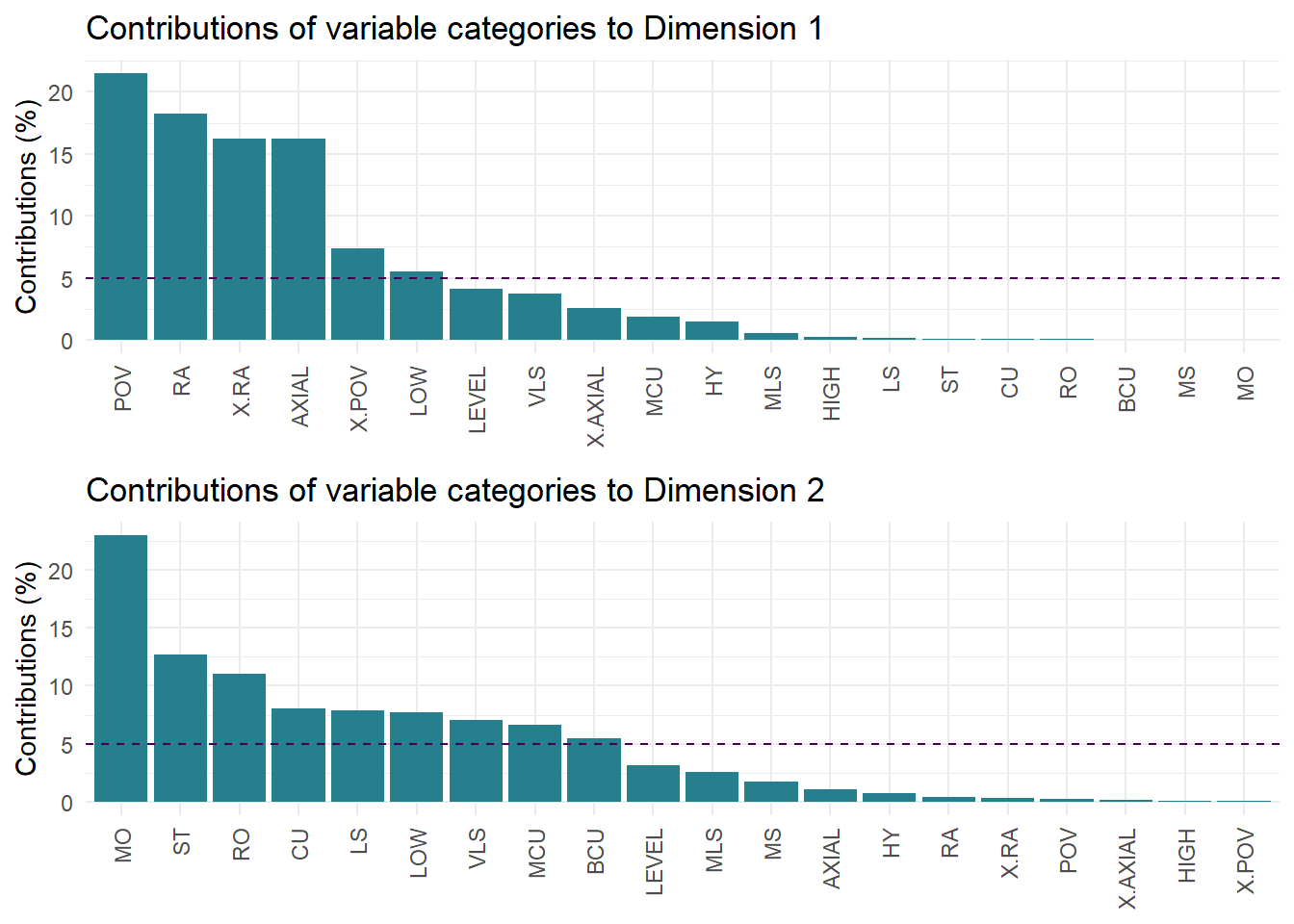
Figure 8.7: Percentage contributions of variable categories to the first two dimensions of multiple correspondence analysis of four narratives in Rashomon.
We access the coordinates of the categories for the active variables using res_mca$var$coord and the coordinates for the supplementary variable using res_mca$quali.sup$coord. Figure 8.8 plots the categories to let us see relationships between the different formal decisions of the filmmakers. Dimension 1 shows there is a contrast between the different ways shots are related. POV and RA are close to one another indicating that these shots of these types tend to be related to one another. This is expected because point-of-view shots are typically framed from the reverse angle to the preceding shot. Shots that are not related by a cut along the lens axis (X.AXIAL) are also closely associated with these types of shots; again this is because an axial cut cannot be a reverse angle cut. Shots related by axial cuts (AXIAL) relative to the preceding shot are associated with non-POV (X.POV) and non-RA (X.RA) shots. Dimension 1 contrasts the different ways in which perspective is created in Rashomon.
df_categories_coords <- data.frame(res_mca$var$coord) %>%
  select(Dim.1, Dim.2) %>%
  rownames_to_column(., var="category") %>%
  # Identify each category by its variable
  mutate(variable = c(rep("shot scale", 7),
                      rep("camera movement", 4),
                      rep("camera angle", 3),
                      rep("POV", 2),rep("RA", 2),
                      rep("Axial", 2)))

df_narrators_coords <- data.frame(res_mca$quali.sup$coord) %>%
  select(Dim.1, Dim.2) %>%
  rownames_to_column(., var="category") %>%
  mutate(variable = rep("narrator", length(category)))

# Combine the data frames together
df_categories_plot <- rbind.data.frame(df_categories_coords,
                                       df_narrators_coords)

ggplot(data = df_categories_plot, aes(x = Dim.1, y = Dim.2)) +
  geom_point(aes(colour = variable)) +
  geom_text_repel(aes(label = category, colour = variable)) +
  geom_hline(aes(yintercept = 0), linetype = "dashed") +
  geom_vline(aes(xintercept = 0), linetype = "dashed") +
  scale_x_continuous(name = "Dimension 1 (12.7%)", limits = c(-1.5, 1.5),
                     breaks = seq(-1.5, 1.5, 0.5)) +
  scale_y_continuous(name = "Dimension 2 (9.2%)", limits = c(-1.6, 1.6),
                     breaks = seq(-1.5, 1.5, 0.5)) +
  scale_colour_viridis_d() +
  theme_minimal() +
  theme(legend.position = "none")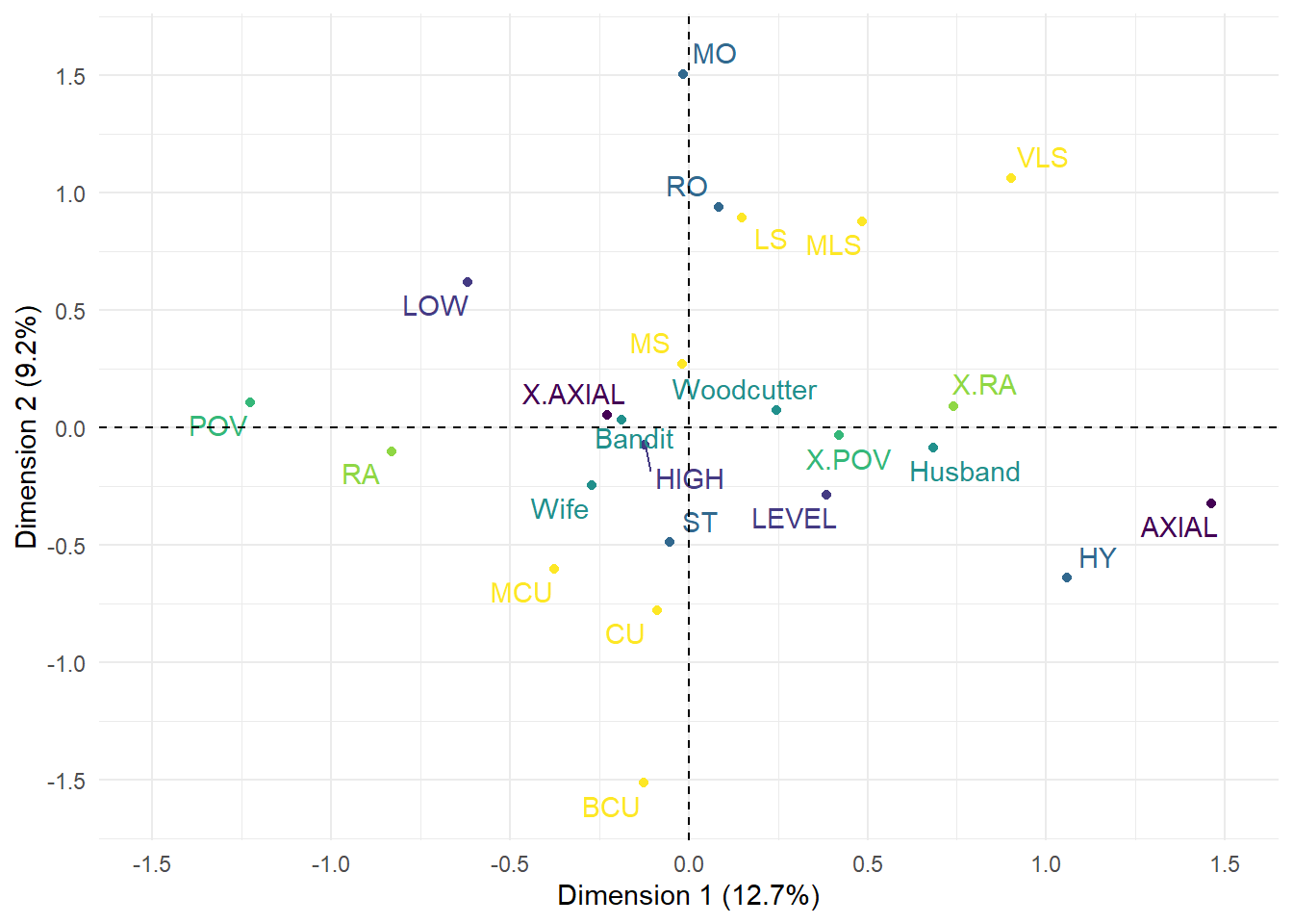
Figure 8.8: Categories map of different elements of film style for four narratives in Rashomon. The narrators are included as supplmentary variables.
The narrators are orientated along Dimension 1 according to how their perspective is created for the viewer. In terms of film form, the Bandit’s narration is most similar to that of the Wife and both are most dissimilar from the narration of the Husband. The narratives told by the Bandit and the Wife feature a larger proportion of POV shots (27% and 38%, respectively) and make extensive use of RA cuts (55% and 52%), whereas shots framed along the lens axis relative to the previous shot account for only 8% and 10%, respectively. In contrast, the Husband’s narration uses fewer POV shots (12%) and RA shots (23%), and AXIAL shots occur much more frequently (35%). We can see from the categories map that the points representing the Bandit and the Wife lie in the direction of POV and RA shot relationships, while that of the Husband lies on the opposite side of the origin in the direction of AXIAL cuts. The version of events told by the Woodcutter falls in between these extremes. In this final narrative, POV (23%) shots and RA shots (37%) are more frequent than in that of the Husband’s and occur less frequently than in those of the Wife and the Bandit (albeit only slightly less in the case of the latter). At the same time, AXIAL cuts (18%) account for more shots than in the tales of the Bandit and the Wife and for a smaller proportion of shots than in the Husband’s tale.
The Wife lies slightly off Dimension 1 and shows some vertical displacement indicating an association (albeit limited) with Dimension 2 not evident for the other narrators to lie closer to the shot scale categories MCU and CU. This reinforces the conclusion we arrived at above that the Wife’s narrative tends to use medium close ups and close ups rather than medium shots.
The second dimension in Figure 8.8 contrasts shot scale and movement. There are no particular relationships between these presentational variables and the different shot types described above indicating that Kurosawa varies the framing of a shot and the movement of the camera when creating a character’s perspective rather than relying on a subset of stylistic choices for each narrator. Shots featuring hybrid camera movements (HY) do not follow the general pattern for movement but account for only a handful of shots in the film and contribute very little to the variance of the data.
Low angle shots tend to be associated with point-of-view shots, while shots with a neutral camera angle (LEVEL) tend to be associated with shots that do not represent a characters point of view. However, the categories of the angle variable are not associated with a particular axis but lie along a diagonal line across the centre of the categories map. This is because while this aspect of film style does contribute to the perspectives of the different narratives it also functions as a presentational device and so lies between the two perspectival and presentational dimensions.
We can also look at the relationships between the variables by plotting the data points for each shot. To access the coordinates for each individual shot of the active variables we use res$ind$coord, where ind is short for ‘individuals’. First, we will look at the distributions of the style variables, creating a plot for each of the six active variables. We will use the GDFAtools package to plot the mean of the each category of a variable (represented by the label for that category) along with a 95% confidence ellipse with the ggadd_ellipse() function.
# Get the coordinates for the individual shots for dimensions 1 and 2
df_individuals <- data.frame(res_mca$ind$coord) %>% select(1:2)

# Add the coordinates for each shot to the df_mca data frame
df_mca <- cbind.data.frame(df_mca, df_individuals)

# Drop the narrator column because we will deal with supplementary variables later
df_mca2 <- df_mca %>% select(-narrator)

# Load the GDAtools package
pacman::p_load(GDAtools)

# Create an empty plot list to store the output of the loop
mca_plot_list <- list()

# Loop over each variable and plot the individuals along with
# the mean of each category of each variable with a 95% confidence ellipse
for (i in 1:6){

  df_temp <- df_mca2 %>% select(c(i, 7:8))
  title <- colnames(df_temp)[1]
  df_temp <- df_temp %>% rename(variable = 1)

  p <- ggplot(data = df_temp) +
    geom_hline(aes(yintercept = 0), linetype = "dashed") +
    geom_vline(aes(xintercept = 0), linetype = "dashed") +
    geom_point(aes(x = Dim.1, y = Dim.2, colour = variable)) +
    scale_x_continuous(name = NULL) +
    scale_y_continuous(name = NULL) +
    ggtitle(title) +
    scale_colour_viridis_d() +
    theme_minimal() +
    theme(aspect.ratio = 1/1)

  # Add the ellipses to the plot using GDAtools::ggadd_ellipses() -
  # make sure to add the variable as a factor
  pp <- ggadd_ellipses(p, res_mca, as.factor(df_temp$variable),
                       label = TRUE, legend = "none")

  # Add the plot to the list
  mca_plot_list[[i]] <- pp

}
Figure 8.9 plots the distributions of shots in the data set coded according to their scale, movement, and angle. The association of scale and movement with Dimension 2 is clear in the vertical arrangement of the mean values of the categories of these variables, while the shots in each category are, for the most part, distributed evenly across Dimension 1. The diagonal trend in angle that associates this variable with both dimensions is again apparent. We can also see more detail about relationships between shots: static shots tend to be more closely framed, while mobile and rotational camera movements tend to be framed as medium shots or more distant.
pacman::p_load(ggpubr)
presentational_figure <- ggarrange(mca_plot_list[[1]],
                                   mca_plot_list[[2]],
                                   mca_plot_list[[3]],
                                   ncol = 3, align = "h")

annotate_figure(presentational_figure,
                bottom = text_grob("Dimension 1 (12.7%)"),
                left = text_grob("Dimension 2 (9.2%)", rot = 90))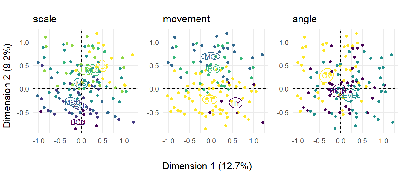
Figure 8.9: The distribution of shots in Rashomon across three formal variables. ☝️
Figure 8.10 plots the three perspectival variables and shows how strongly these are associated with Dimension 1. pov shots are contrasted with axial shots, while there is a clear split between those shots that are linked by reverse-angle cuts and those that are not. It is clear that while most point-of-view shots are associated with reverse-angle cuts, Kurosawa makes extensive use of reverse-angle cuts in other situations as well. For all three variables, the shots are distributed evenly along Dimension 2, indicating that perspectival stylistic features in Rashomon are associated with the full range of shot scales and camera movements and are not limited to a particular subset of presentational devices. There is a tendency for shots linked by axial cuts to be associated to have a LEVEL camera angle, though this is to be expected because these shots will be related by their subject matter.
perspectival_figure <- ggarrange(mca_plot_list[[4]],
                                 mca_plot_list[[5]],
                                 mca_plot_list[[6]],
                                 ncol = 3, align = "h")

annotate_figure(perspectival_figure,
                bottom = text_grob("Dimension 1 (12.7%)"),
                left = text_grob("Dimension 2 (9.2%)", rot = 90))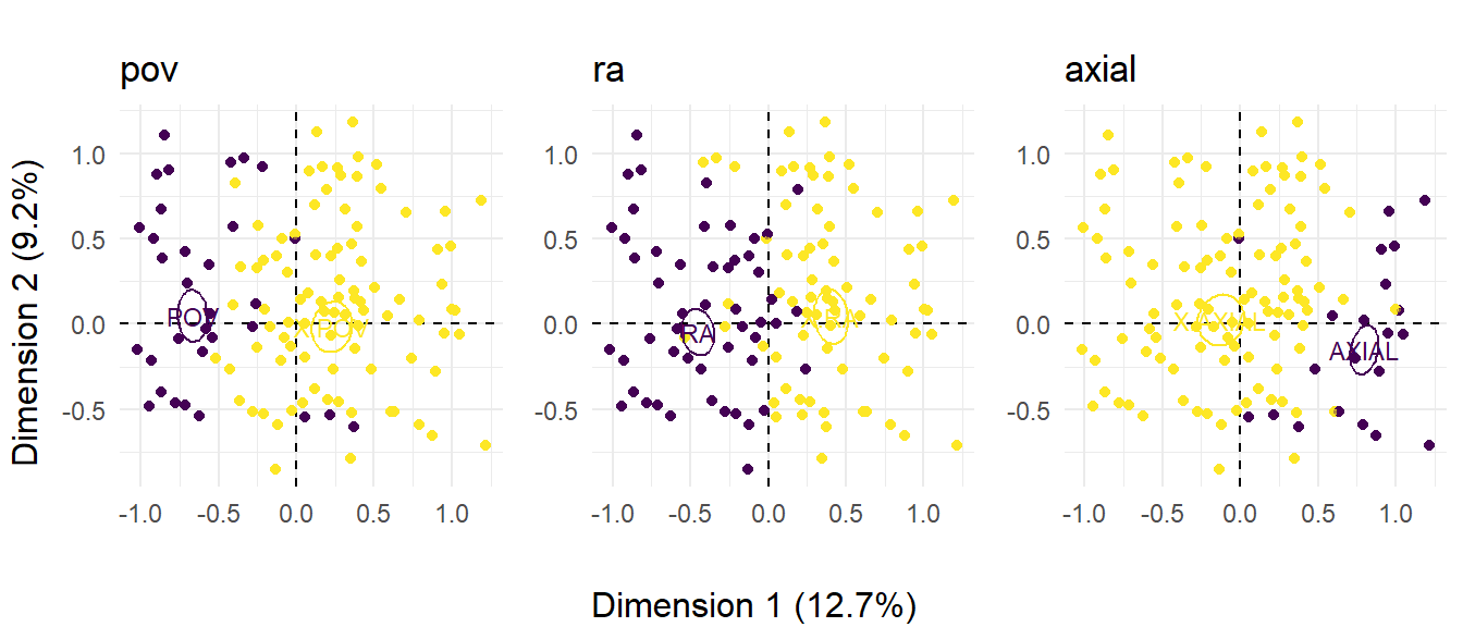
Figure 8.10: The distribution of shots in Rashomon across three perspectival variables. ☝️
Figure 8.11 plots the distribution of the shots encoded by narrator. This plot confirms our conclusion that the narratives of the Bandit and the Wife tend to be associated with POV and RA shots, while that of the Husband tends to be associated with AXIAL cuts. We can also see that each narrative uses a wide range of different types of shots and that despite these tendencies, is more diverse than the categories map suggests. This map also reinforces that the Woodcutter’s narrative lies between narratives of the Bandit and the Wife and the narrative of the Husband with no tendency towards any particular perspectival formal attributes, with shots in this narrative distributed across the map.
# We added the coordinates of the individual shots to the df_mca data frame
# earlier so we can use that for plotting the points for the narrators
narrators_mca_plot <- ggplot(data = df_mca) +
    geom_hline(aes(yintercept = 0), linetype = "dashed") +
    geom_vline(aes(xintercept = 0), linetype = "dashed") +
    geom_point(aes(x = Dim.1, y = Dim.2, colour = narrator)) +
    scale_x_continuous(name = "Dimension 1 (12.7%)") +
    scale_y_continuous(name = "Dimension 2 (9.2%)") +
    scale_colour_viridis_d() +
    theme_minimal() +
    theme(aspect.ratio = 1/1)

narrators_mca_plot <- ggadd_ellipses(narrators_mca_plot, res_mca,
                                     as.factor(df_mca$narrator),
                                     label = TRUE, legend = "none")

narrators_mca_plot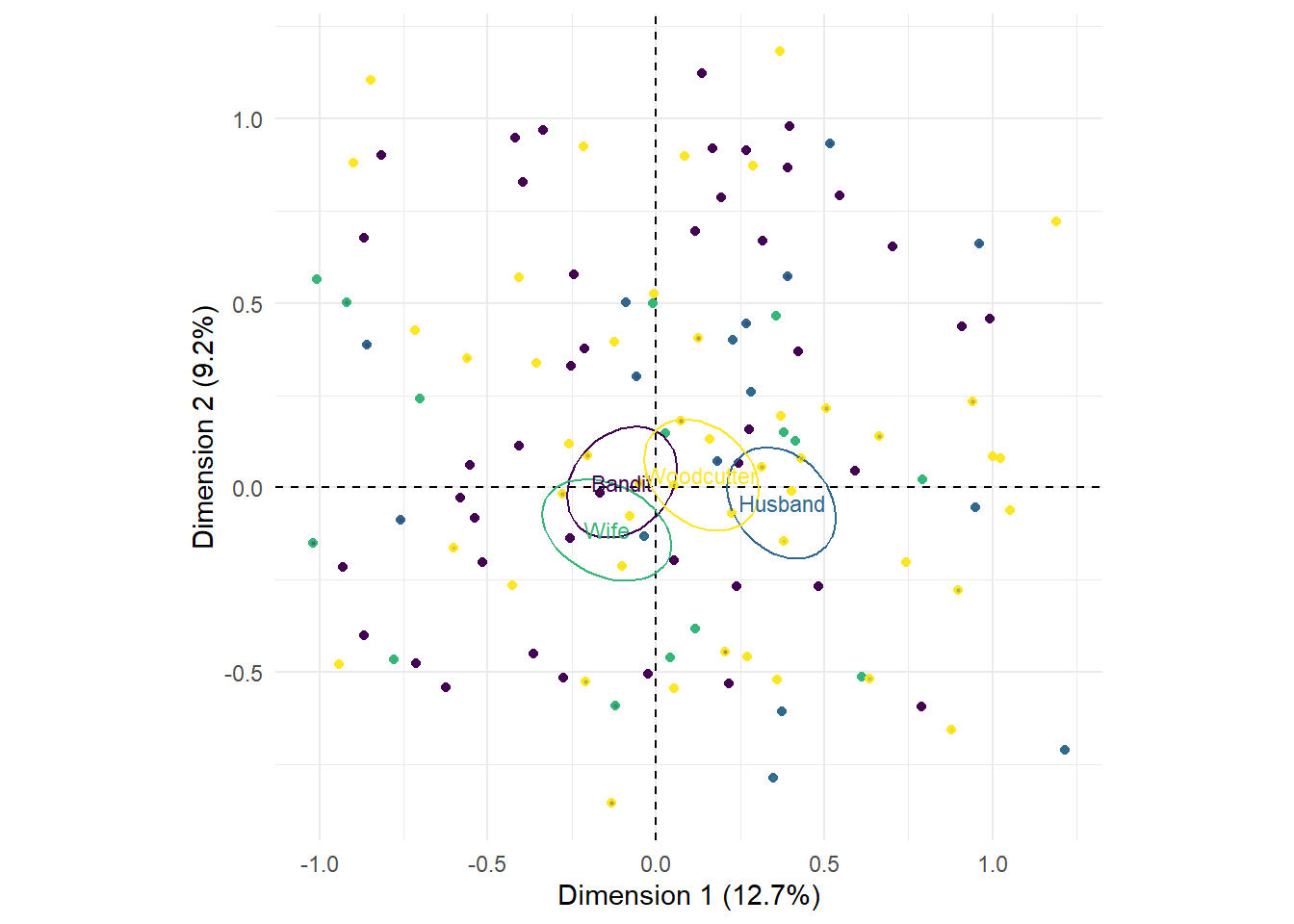
Figure 8.11: The distribution of shots in Rashomon across the different narrators.
The results of applying multiple correspondence analysis to style of the different narratives in Rashomon reveal the different ways in which the perspectives of the narrators are created.
The perspectives of the Bandit and the Wife are created through the use of point-of-view shots and reverse-angle cuts, providing direct access to each narrator’s perspective so that the viewer sees what they see and, at the same time, is given access to how they imagine others see them. For example, the Wife’s narrative includes an exchange of nine point-of-view shots between her and her husband: the shots of the Husband from the Wife’s position show the viewer what she saw (the contempt on her Husband’s face); while the shots framed from the Husband’s position show us how the Wife imagines herself to be seen as she pleads for understanding. Similar exchanges occur early in the Bandit’s narrative as he first sets eyes on the Wife and later in the three-way exchange of POV shots after the rape and between Bandit and Husband as they prepare to duel. This use of POV shots establishes the Bandit and the Wife as active narrators, not merely recounting events of the past but aligning the viewer physically and psychologically with their perspective.
In the Husband’s narrative it is the relative scarcity of such shots that stands out. The Husband is a passive narrator forced to watch events but unable to affect them, and by using AXIAL cuts in place of POV and RA shots Kurosawa shows us events happening before the Husband and then his response to them without admitting the viewer direct access to his perspective. We do not see how the Husband conceives of others or as he sees himself in their eyes.
As a witness to events in the forest, the Woodcutter is the source of the only first-hand account available to the Priest and the Commoner (and, by extension, to the viewer). His version of events is presented as an apparently objective account from a third-person narrator standing outside events and able to describe the actions of those he observes in all their complexity without the prejudice of their own self-serving perspectives. The content of the story he tells combines some material from each the prior three versions (the duel, the husband’s rejection of the wife, the wife’s flight, etc.), thereby corroborating some part of each without definitively ruling one version more reliable from the others. At the same time his account employs elements of the narration from the other three versions, combining some of the active components of the testimonies of the Bandit and the Wife and some of the passivity of the Husband’s narration. POV shots are used in the same way as the narration of the Bandit and the Wife, cutting between the Bandit and the Husband as they stalk one another prior to the duel, or the fraught exchange of glances between Wife and Husband; and axial cuts are used to show the character’s looking or being looked at while refusing the glance-object structure of the POV shot, even repeating some of the set-ups from the Husband’s section. One key difference from earlier narratives is that some axial cuts are now associated with the Bandit as well as the Husband, attributing to the Bandit a more passive demeanour, especially at the beginning of the sword fight which lacks the virility of his own narrative.
The computational approach we have applied above will not resolve the ambiguities at the heart of Rashomon; but by examining simultaneously various aspects of film style across hundreds of shots we begin to understand the fundamental role played by film style in creating those ambiguities.
8.6 Summary
Choosing an appropriate method for data analysis means knowing the difference between different types of variables – qualitative/quantitative, discrete/continuous, categorical/numerical. Discrete qualitative categorical variables of film style include shot scale, camera movement, shot transitions, or any other way we choose to label a shot. Analysing these variables requires a different set of methods to continuous quantitative numerical variables (such as shot length data).